import pandas as pd
import numpy as npIntro
I have a couple of projects with browser applications that could benefit from some visualisations of stocks and flows, possibly animated. I gather that using an ecosystem such as D3.js or related is a likely must.
I will start however with Python based tools since this is a more familiar entry point.
Scaning the literature
- Sankey diagrams articles:
- https://www.data-to-viz.com/graph/sankey.html
- https://www.sankey-diagrams.com/tag/australia/
- R ecosystem:
- https://www.marsja.se/create-a-sankey-plot-in-r-ggplot2-plotly/
- https://rdrr.io/cran/networkD3/
- Python may have a zoo of more or less baked packages; perhaps two promising are:
- https://github.com/ricklupton/floweaver
- https://github.com/d3blocks/d3blocks
- Python related
- Process Mining with Sankey Diagrams in Motion. Plotly, one indeed animated with time dependent data.
- Sankey diagram in Python - plotly
- 4 interactive Sankey diagrams made in Python - plotly
- JavaScript
- Other Articles
- Newbie to D3.js Expert: Complete path to create interactive visualization using D3.js
- D3.js Tutorial – Data Visualization for Beginners
- Creating beautiful stand-alone interactive D3 charts with Python
- Data visualization with D3.js for beginners
- Powerful Tool to Focus on Stocks and Flows
- Custom D3.js Visualization in a Jupyter Notebook written in 2018
- D3.js 🖤 Jupyter notebook using templates strings.
Use case
Using the Biomass for Bioenergy Project as a case study for this. We want to visualise the flow of dry tonnes of feedstock material, for instance.
Defining an example
wheat_tonnage = 1e5
barley_tonnage = 2e5
# "losses" of some processes as a fraction
transport_loss_fact = 3e-2
pellet_loss_fact = 6e-2

straw_tonnage = wheat_tonnage + barley_tonnage
raw_noloss = straw_tonnage * (1-transport_loss_fact)
coal_tonnage = 5e5

df = pd.DataFrame.from_dict({
    "source": ['Wheat straw', 'Barley straw', "Transport", "Transport", "Storage hub", "Pellet plant", "Pellet plant", "Coal"],
    "target": ["Transport", "Transport", "Losses", 'Storage hub', "Pellet plant", 'Losses', 'Co-firing', 'Co-firing'],
    "weight": [wheat_tonnage,
               barley_tonnage,
               straw_tonnage * transport_loss_fact,
               raw_noloss,
               raw_noloss,
               raw_noloss * pellet_loss_fact,
               raw_noloss * (1-pellet_loss_fact),
               coal_tonnage
              ]
}
)df| source | target | weight | |
|---|---|---|---|
| 0 | Wheat straw | Transport | 100000.0 |
| 1 | Barley straw | Transport | 200000.0 |
| 2 | Transport | Losses | 9000.0 |
| 3 | Transport | Storage hub | 291000.0 |
| 4 | Storage hub | Pellet plant | 291000.0 |
| 5 | Pellet plant | Losses | 17460.0 |
| 6 | Pellet plant | Co-firing | 273540.0 |
| 7 | Coal | Co-firing | 500000.0 |
With D3blocks
Note that the license of d3blocks is “GNU GENERAL PUBLIC LICENSE v3”. It may or may not be compatible with my, and your, projects. Let’s still give a try
Installation
mamba activate bm
mamba install -c conda-forge numpy pandas tqdm jinja2 scikit-learn requests
pip install --no-deps d3graph colourmap ismember elasticgraph
cd ~/src/d3blocks
pip install -e .Installing collected packages: python-louvain, markupsafe, d3blocksTrial on our data
import d3blocks
print(d3blocks.__version__)1.3.0from d3blocks import D3Blocks# Initialize
d3 = D3Blocks()[d3blocks] >INFO> Cleaning edge_properties and config parameters..Using a diaplsy with notebook=False and showfig=True opens a new tab. Curiously it embeds an advertisement, at least by default (see screen capture below)
# Input parameters.
_ = d3.sankey(df,
          title='Sankey - d3blocks',
          filepath='sankey.html',
          notebook=False,
          figsize=(800, 600),
          node={"align": "justify", "width": 15, "padding": 15, "color": "currentColor"},
          link={"color": "source-target", "stroke_opacity": 0.5},
          margin={"top": 5, "right": 1, "bottom": 5, "left": 1},
          showfig=True,
          overwrite=True)
[d3blocks] >INFO> Cleaning edge_properties and config parameters..
[d3blocks] >INFO> Initializing [Sankey]
[d3blocks] >INFO> filepath is set to [/tmp/d3blocks/sankey.html]
[d3blocks] >INFO> Convert to Frame.
[d3blocks] >INFO> Node properties are set.
[d3blocks] >INFO> Edge properties are set.
[d3blocks] >INFO> File already exists and will be overwritten: [/tmp/d3blocks/sankey.html]
[d3blocks] >INFO> Open browser: /tmp/d3blocks/sankey.html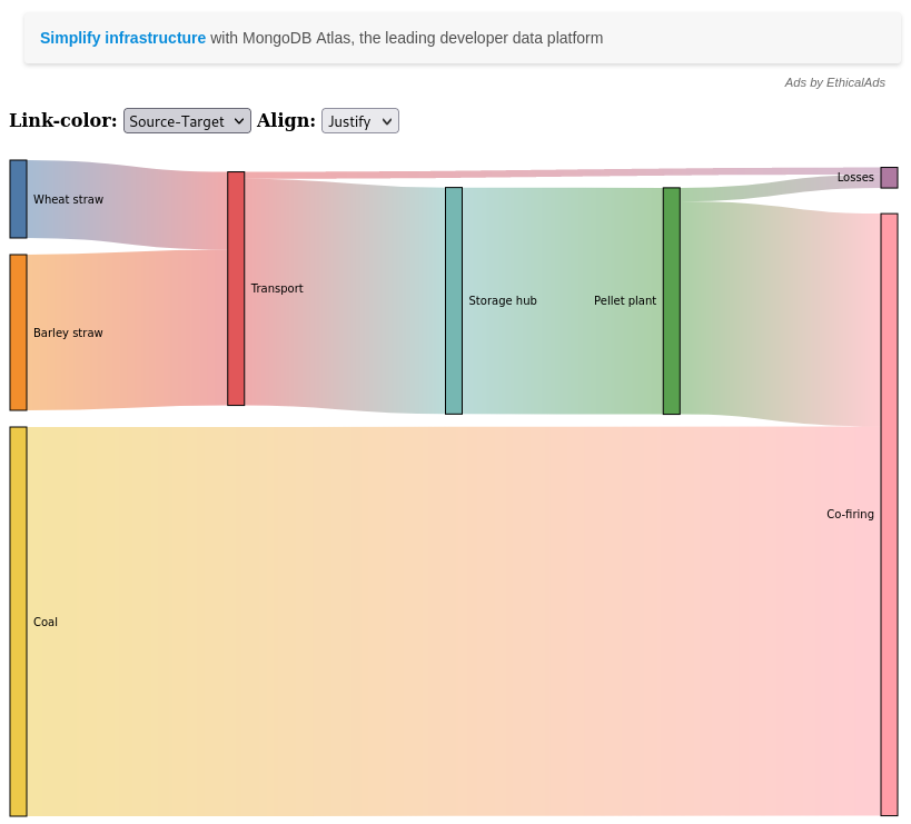
Trying to display inline in the notebook with notebook=True fails to display in this notebook run via jupyter-lab (3.4.7). The drop down boxes (and the advertisement) do display, but not the graph, which appears elsewhere unexpected on the page.
# Not running: it renders outside. Also, has an advertisement.
# d3.sankey(df,
#           title='Sankey - d3blocks',
#           filepath=None,
#           notebook=True)
Using Plotly
The page How to make Sankey Diagrams in Python with Plotly. looks promising
mamba install -c conda-forge plotly
Restart jupyter-lab in case an extension has been installed to jupyter-lab
Let’s see if we can display a vanilla example:
import plotly.graph_objects as go

fig = go.Figure(data=[go.Sankey(
    node = dict(
      pad = 15,
      thickness = 20,
      line = dict(color = "black", width = 0.5),
      label = ["A1", "A2", "B1", "B2", "C1", "C2"],
      color = "blue"
    ),
    link = dict(
      source = [0, 1, 0, 2, 3, 3], # indices correspond to labels, eg A1, A2, A1, B1, ...
      target = [2, 3, 3, 4, 4, 5],
      value = [8, 4, 2, 8, 4, 2]
  ))])

fig.update_layout(title_text="Basic Sankey Diagram", font_size=10)
fig.show()
Our data
Now trying on our data. We need to do a bit of legwork to retrieve the unique node names and use their indices to define the links, which is a tad inconvenient as an API, but an understandable choice nonetheless.
node_names = list(set(list(df.source.values) + list(df.target.values) ))
node_names
['Losses',
'Wheat straw',
'Coal',
'Co-firing',
'Transport',
'Pellet plant',
'Barley straw',
'Storage hub']indices = {node_names[i]: i for i in range(len(node_names))}fig = go.Figure(data=[go.Sankey(
# valueformat = ".0f",
valuesuffix = "T",
# Define nodes
node = dict(
pad = 15,
thickness = 20,
line = dict(color = "black", width = 0.5),
label = node_names,
# color = data['data'][0]['node']['color']
color = "blue"
),
# Add links
link = dict(
source = [indices[k] for k in df.source.values],
target = [indices[k] for k in df.target.values],
value = df.weight.values.tolist(),
# label = data['data'][0]['link']['label'],
# color = data['data'][0]['link']['color']
color='lightgrey'
))])
fig.update_layout(title_text="Made up data for a <a href='https://www.dpi.nsw.gov.au/forestry/science/forest-carbon/biomass-for-bioenergy/'>biomass for bioenergy</a> scenario",
font_size=10)
# fig.layout.height = 500
fig.show()Conclusion
This is not an exhaustive look at the charting options in Python binding to d3.js. Plotly clearly passes the “pub test” for producing a Sankey diagram. The MIT licensing of plotly. If I can weave plotly graph objects into a project otherwise built on top of ipywidgets, this is promising.